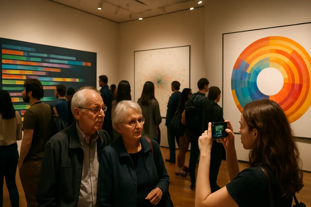
Information design has often been treated as a practical tool: a chart that clarifies a statistic, a map that directs movement, or a diagram that condenses a larger system. MoMA’s Full Disclosure: The Edge of Information Design, which opened on September 27, 2026, gives that practice a more focused museum setting. The exhibition is scheduled to remain on view through June 13, 2027, and MoMA identifies it as the museum’s first exhibition devoted entirely to this field.
The timing matters because the show does not frame charts, maps, interfaces, and data portraits as neutral containers. It presents them as designed objects with choices embedded in them: what to measure, what to omit, who is represented, and how trust is built or weakened. That emphasis makes the exhibition useful not only for designers, but also for artists, educators, journalists, and community historians who work with public evidence.
Why Information Design Now Has A MoMA Stage
Information Design As A Collection Category
MoMA’s press materials describe Full Disclosure as a presentation of 30 works, spanning both digital and analog forms, with six pieces newly acquired for the museum’s collection. The exhibition is organized by Paola Antonelli, Senior Curator in the Department of Architecture and Design and Director of Research and Development, with Jules Bernstein, Curatorial Assistant, and Forrest Pelsue, the 2025–26 Marron Research Consortium Fellow. These details, taken together, show the museum treating the field as part of design history rather than as a technical footnote. The exhibition details are outlined in MoMA press materials.
That framing is significant, but it should be read with care. A museum exhibition does not prove a universal cultural shift by itself. It does, however, mark an institutional decision about what belongs in a design collection. By placing works of evidence, mapping, climate communication, and historical analysis together, MoMA presents information design as a practice shaped by aesthetics, research, and public responsibility.
What The Dates And Location Signal
The exhibition’s location also carries meaning. MoMA states that Full Disclosure is installed in its street-level gallery, which is free and accessible to the public. That setting aligns with the subject matter: many of the works address issues that depend on public legibility, from environmental change to migration, poverty, and state power. A free gallery does not remove every barrier to access, but it does place the material closer to the public-facing edge of the museum.
The exhibition opened on September 27, 2026, so it should be discussed as an active presentation rather than an upcoming one. Its scheduled closing date, June 13, 2027, gives the museum a long window for visitors, educators, and critics to assess how the installation handles a subject that can easily become opaque. The strongest measure of the show may be whether viewers leave with sharper questions about evidence, not simply with admiration for polished diagrams.
What Full Disclosure Places On View
Digital And Analog Forms
The 30 works named in the research materials indicate a broad range of formats and time periods. Chow and Lin’s The Poverty Line (Tomatoes) (Myanmar), 2010–2020 approaches economic conditions through image and comparison. Forensic Architecture, Forensic Oceanography. Seizure of the Iuventa from 2019 points toward investigative work, where design helps assemble and present evidence. Ed Hawkins’s Warming Stripes, 1850–2025, begun in 2018 and described as ongoing, condenses climate records into a form that is visually direct. Ben Fry’s isometricblocks, from 2002–05, adds an earlier digital design reference point.
These examples suggest that Full Disclosure is not organized around one visual style. Its common thread is a design problem: how information can be structured so that viewers can perceive a pattern, test a claim, or understand a relationship. That is a different task from illustration alone. It asks form to carry evidence, and it asks audiences to recognize the difference between persuasion and verification.
Artistic Context Without Flattening The Work
There is a risk, in any exhibition about data, of reducing works to their subject matter. A climate graphic can become only “about climate.” A poverty study can become only “about poverty.” A forensic project can become only “about evidence.” The more careful reading is to examine how each work uses scale, sequence, color, repetition, absence, and comparison. Those formal choices are part of the meaning, not decoration added after the facts.
That point connects the exhibition to broader creative communities. Costume makers, textile artists, set designers, and independent sellers also work with systems of visual meaning: patterns, measurements, cultural references, and audience recognition. Related writing on costume and fashion culture research offers one adjacent path for thinking about how design choices communicate identity and context. The connection is not that every medium handles data in the same way. It is that form often determines what a community can see, remember, and debate.
Reading The Works Across Time And Medium
Historical Continuity And New Tools
The research notes describe data visualization as a practice with centuries of precedent, while the exhibition focuses on 20th- and 21st-century developments. That pairing matters. It prevents the show from treating recent software as the origin of visual evidence. At the same time, the inclusion of digital works acknowledges that algorithms, machine learning, artificial intelligence, and animated networks have changed the forms available to designers.
Care is needed here, because technology alone does not guarantee clarity. A dynamic interface can reveal relationships that a static chart cannot easily show, but movement can also distract or imply certainty where the underlying data is partial. A printed image may appear simpler, yet it can still carry strong analytical force. The exhibition’s mix of analog and digital forms allows those differences to sit beside one another without forcing a single hierarchy.
Data Portraits And Community Memory
The ethical charge of data becomes clearer through MoMA Magazine’s discussion of W. E. B. Du Bois’s data portraits, which returned attention to historical methods of visualizing Black life, migration, and social conditions. The MoMA Magazine essay connects the subject to representation, visibility, and the responsibilities of design. That context is valuable because it shows that data is never only numerical. It can also be social memory, political record, and cultural argument.
For community stories, this is a central issue. Who gathers the data? Who is missing from it? Who has the authority to interpret it? Which visual form makes a pattern legible without stripping people of context? Full Disclosure appears to position these questions within design practice rather than outside it. That is a productive stance, especially for viewers who approach museum objects as evidence of choices made under social pressure.
The Ethics Behind Information Design

The exhibition’s title, Full Disclosure, suggests openness, but the research points to a more demanding idea. Disclosure is not only the act of presenting information. It is also the work of showing how that information was sourced, organized, filtered, and made persuasive. A chart can look authoritative while concealing uncertainty. A map can appear complete while leaving out communities, borders, routes, or histories. A timeline can create order while narrowing causality.
This is where information design becomes ethically charged. Designers make decisions that affect trust: categories, colors, scales, labels, animation speed, comparison points, and captions. Those decisions can help viewers ask better questions, or they can lead viewers toward a predetermined reading. The research notes also point to concerns around bias, transparency, and institutional distrust. Those concerns are not abstract. They shape how audiences respond to public data, especially when the subject involves harm, displacement, climate, or state action.
A cautious reading of the show should resist two extremes. One extreme treats designed data as objective truth because it looks ordered. The other rejects visual evidence as manipulation because it is designed. The more useful approach sits between them: ask what the work claims, what materials support that claim, what remains uncertain, and how the design invites or limits interpretation.
Information Design At MoMA’s Full Disclosure
Full Disclosure: The Edge of Information Design gives MoMA a focused platform for works that make systems visible, but it also asks viewers to examine visibility itself. The exhibition’s 30 works, its free street-level placement, and its scheduled run from September 27, 2026, to June 13, 2027, give the subject a public setting with enough time for close reading.
Its value may rest less in declaring a rise than in showing why the field now demands sustained cultural criticism. The exhibition gathers objects that sit between art, design, research, journalism, and public memory. For audiences willing to look slowly, the key question is not whether data can be beautiful. It is whether beauty, structure, and evidence can meet without obscuring the people and conditions being represented.