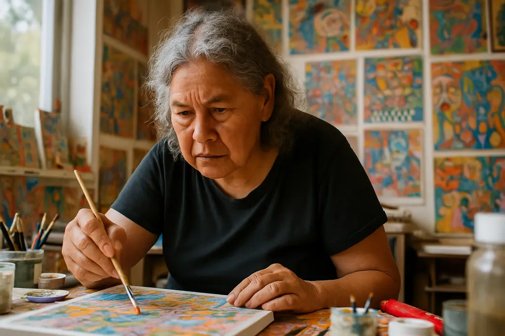
Susan Te Kahurangi King received a focused West Coast presentation after The Page Before Me ran at James Fuentes Gallery in Los Angeles from August 1 to September 12, 2026. The exhibition has now closed, so the useful question is not whether to see it, but what the show clarified about an artist whose drawings and mixed-media works ask for slow looking, restraint, and respect.
The exhibition mattered because it placed early and recent work in relation to one another. According to the gallery, the show covered King’s production from the late 1950s through the present, included some of her earliest drawings, and featured what the gallery described as her largest work to date. That broad time span gave viewers a rare chance to consider continuity without reducing the work to biography or novelty.
Why Susan Te Kahurangi King Mattered In Los Angeles
Susan Te Kahurangi King And The West Coast Context
James Fuentes presented The Page Before Me as King’s first solo exhibition on the West Coast and organized it in collaboration with MARCH, New York. The gallery’s account also describes the exhibition as an overview of her graphic development, spanning from the late 1950s to the present James Fuentes exhibition page. Because the exhibition has already taken place, its significance is best understood through the record it left: a concentrated Los Angeles viewing of work that has been entering major institutional conversations.
That West Coast framing is more than geographic. Los Angeles has long been a city where animation, comics, studio image-making, and experimental drawing can be seen beside contemporary art practices. The research supplied for this article supports discussion of King’s use of cartoon and comic visual culture, but it would be too strong to claim a direct relationship between the exhibition and any broad market shift without stronger evidence. A careful reading treats the show as a specific curatorial event rather than proof of a trend.
A Biographical Frame Used With Care
Galerie reported that King was born in 1951 in Te Aroha, New Zealand, began drawing at a young age, stopped speaking around age four, and was silent by age eight Galerie’s September art coverage. Those details are often repeated because they shape how writers introduce her work, yet they should not become a shortcut for interpretation. Silence, family care, and long-term drawing practice are relevant facts, but the drawings still deserve to be read as art objects with structure, material decisions, and visual intelligence.
For Susan Te Kahurangi King, the page is not a passive container. The works described by James Fuentes include graphite, colored pencil, watercolor, collage, and hand-coloured elements on found or unconventional papers. Some works are double-sided, folded, creased, overlaid, or marked by physical changes in the surface. These facts support an interpretation of the work as both image and object, where paper condition can shape how a composition is seen.
Materials In Susan Te Kahurangi King Mixed-Media Work
Drawing As A Physical Encounter
The strongest lesson from The Page Before Me may be material. King’s mixed-media work is not simply drawing plus added color. The gallery description points to surfaces that can be found, folded, creased, layered, or physically altered. That means the viewer is asked to look at paper as an active participant. A crease may interrupt a figure, a fold may create a new boundary, and a double-sided sheet may complicate the idea of a single front-facing image.
This is where arts education and wellness can meet without forcing a therapeutic reading onto the artist. For students, artists, and community workshop leaders, King’s work demonstrates how attention can move through a page. Looking slowly at surface, pressure, line, and repetition becomes a form of embodied observation. It asks the body to pause, breathe, and track relationships across a sheet. That does not mean the art is made for wellness practice; it means careful viewing can support healthier habits in art spaces.
Scale, Time, And The Problem Of Easy Labels
The exhibition’s time span, from the late 1950s to works made near the present, resists a simple story of early promise followed by late recognition. Because the available source material states that the show included early drawings and the artist’s largest work, the safer interpretation is formal rather than speculative: the exhibition allowed changes in scale, density, and handling to be placed side by side. It did not require a single explanation for every shift.
Labels such as outsider art, self-taught art, contemporary drawing, and mixed-media practice may each help certain institutions place the work, but none should substitute for looking. King’s inclusion in collections named by James Fuentes, including MoMA in New York, the American Folk Art Museum, the Philadelphia Museum of Art, the Institute of Contemporary Art Miami, Te Papa Museum in Wellington, the Chartwell Collection at Auckland Art Gallery, and the Art Gallery of New South Wales, indicates that several kinds of institutions have found the work significant. That fact supports the need for critical care, not a claim that the work belongs to only one category.
Institutional Recognition And Ethical Attention
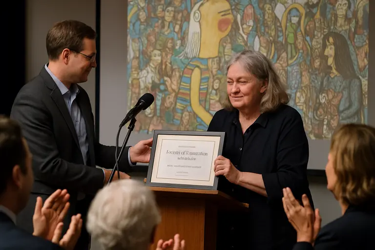
How Viewers Can Read Without Reducing
Respectful criticism begins by refusing to treat an artist’s life as an explanation that closes the work down. In King’s case, the biographical facts available through arts coverage are striking, but her drawings also require attention to composition, material, and duration. A viewer can ask practical questions: Where does the eye enter the work? Which marks seem layered over earlier decisions? How does the edge of the paper affect the image? What happens when a figure, shape, or color field pushes against a fold?
Those questions are useful because they move discussion away from spectacle. They also create better learning environments. In a classroom, studio visit, or gallery discussion group, participants can compare what they see before reaching for biography. This approach respects the artist and gives viewers of different backgrounds a way into the work without pretending to solve it.
A Note For Creators And Sellers
Artists, illustrators, and handmade sellers may feel inspired by the tactile intelligence of this work, but inspiration should not become imitation presented as someone else’s visual identity. A rights-conscious approach is cautious: study how materials behave, how found paper changes a drawing, or how scale affects attention, rather than copying specific images, figures, or recognizable compositional signatures. For adjacent arts education and maker-community resources, the helpful Robsonic website is part of a collaborative hub for culture-focused sites.
This distinction matters for creator commerce. King’s practice can encourage artists to experiment with their own papers, folds, erasures or non-erasures, color layers, and physical supports, but no article can provide legal certainty about a particular derivative work, license, or fair use question. The safer cultural practice is attribution where appropriate, independent development, and a clear separation between study and commercial copying.
What The Page Before Me Clarified About Susan Te Kahurangi King
The Page Before Me clarified that King’s mixed-media work rewards attention to both image and support. The 2026 Los Angeles exhibition gathered a long arc of production, from early drawings to recent large-scale work, and placed that arc before viewers after decades of artistic activity. Its value lay in giving the page itself a central role: as surface, object, record, and site of visual decision-making.
The most responsible celebration is therefore not loud praise without evidence. It is patient description. Susan Te Kahurangi King can be discussed through dates, exhibition history, materials, and institutional recognition, while still leaving room for uncertainty. Her work does not need to be simplified to be admired. It asks viewers to stay with the page long enough for line, color, paper, and pressure to become the subject.