Blog

  • Rockwell Museum Exhibitions Reframe America

    Rockwell Museum Exhibitions Reframe America

    Rockwell Museum Exhibitions in fall 2026 placed American art under a civic lens: who gets represented, how public hardship shapes art, and how a museum can ask visitors to test their own curatorial instincts. As of September 28, 2026, the museum’s fall program was already underway, with two main exhibitions and one participatory installation running into January 2027.

    The strongest thread across the program is not a single style or period. It is a question of framing. The Rockwell Museum in Corning, New York, used its 50th anniversary year and the United States’ 250-year national milestone to reconsider the museum’s collection through labor, memory, identity, place, and public life. That is a large interpretive task, so the most useful way to read the season is exhibition by exhibition, then through the community-facing choices that link them.

    Rockwell Museum Exhibitions And The 2026 Frame

    How Rockwell Museum Exhibitions Use Dates And Space

    The museum’s fall exhibitions overlapped by design. Rockwell Reframed: Director’s Choice opened on August 29, 2026, and was scheduled to run through January 4, 2027 in the Special Projects Gallery on Floor 2. Art at Work: Reframing Artists of the WPA opened on September 5, 2026, and was scheduled to run through January 19, 2027 in the Spotlight Gallery on Floor 1M. A related hands-on installation, Reframe/Re-Arrange, also opened on September 5, 2026, with a closing date of January 3, 2027.

    Those dates matter because, on September 28, 2026, none of these projects had closed. They were not previews or speculative announcements. They were active exhibitions with distinct gallery locations and connected interpretive aims, according to the museum’s fall exhibition announcement.

    The Anniversary Context

    The museum tied the season to two anniversaries: The Rockwell Museum’s founding in 1976, marking 50 years, and the United States’ 250-year national milestone. That framing helps explain why the program does not treat American art as a fixed inheritance. Instead, it asks how historical artworks, modern works, and contemporary works can be placed in conversation without smoothing away questions of inequity, labor, exclusion, and belonging.

    This is where the museum’s collection depth matters. The Rockwell Museum reports nearly 3,000 objects, with strengths in historic and contemporary Native American art, 19th-century views of place, traditional bronze sculpture, and a growing body of modern and contemporary works. The fall program used that collection profile not as background decoration, but as an interpretive structure.

    Art At Work And The WPA Question

    Labor, Community, And Public Art

    Art at Work: Reframing Artists of the WPA revisited artists connected to the Works Progress Administration era of the New Deal, from the 1930s into the early 1940s. The museum’s stated themes included labor, community, resilience, and social change. That makes the exhibition especially resonant in a community setting because WPA-era art was tied to public patronage and to questions about what artists contribute during periods of economic hardship.

    The listed artists included Thomas Hart Benton, Philip Evergood, William Gropper, Yasuo Kuniyoshi, Elizabeth Olds, Reginald Marsh, and Dox Thrash, among others. The grouping is not a neutral roll call. These artists worked across different subjects, methods, and social commitments, yet the museum’s framing drew attention to how art can register work, class pressure, public identity, and community life.

    For readers who want a related focus on this specific exhibition, our companion piece on WPA artists at The Rockwell Museum considers how public patronage and community themes shape the show’s interpretive charge.

    Why Reframing Matters Here

    The word “reframing” can sound fashionable when it is used loosely. In this case, the museum gave it a concrete function: placing WPA-era artists within a present-day discussion about resilience and social change. That does not mean collapsing the 1930s into 2026. It means asking how art made under one set of public pressures can help viewers think about public responsibility in another period.

    For a community organizer, that is one of the most valuable aspects of the exhibition. It treats artists as participants in civic life, not as figures detached from the conditions around them. The show’s caution is also important: it does not require every artist to say the same thing, and it does not reduce the WPA period to a single lesson.

    Rockwell Reframed And Collection Choice

    Director’s Choice As An Argument

    Rockwell Reframed: Director’s Choice was curated by Executive Director Erin M. Coe and included a personal selection of 25 works by historic and contemporary artists. The museum organized the exhibition into eight thematic groupings, including memory, identity, and sense of place. That structure signals that the director’s selections were not only about individual masterworks. They were about relationships among works.

    The artists named in the museum’s materials included Romare Bearden, Jacob Lawrence, Arthur Dove, John Marin, Betye Saar, Whitfield Lovell, Jaune Quick-to-See Smith, John Steuart Curry, and Samuel Levi Jones. Such a roster can support several readings: American modernism, collage and assemblage, social memory, regional identity, and the pressure that history places on images.

    Recent Acquisitions In The Reframed Selection

    The exhibition also introduced recent acquisitions. Eastman Johnson’s Study from Life: Down East was identified as the museum’s first historic genre painting added to the collection. Grafton Tyler Brown’s Grand Canyon and Falls from Hayden Point, Yellowstone was presented as an expansion of the museum’s 19th-century American holdings tied to place and national imagery.

    These additions deserve careful language. They do not, by themselves, redefine the whole museum. The supported claim is narrower and more useful: the acquisitions broaden areas already connected to the institution’s collecting interests. They also give the director’s exhibition a live institutional function, showing how a museum can use acquisitions to shift what future visitors are able to compare.

    Visitor Participation And Community Interpretation
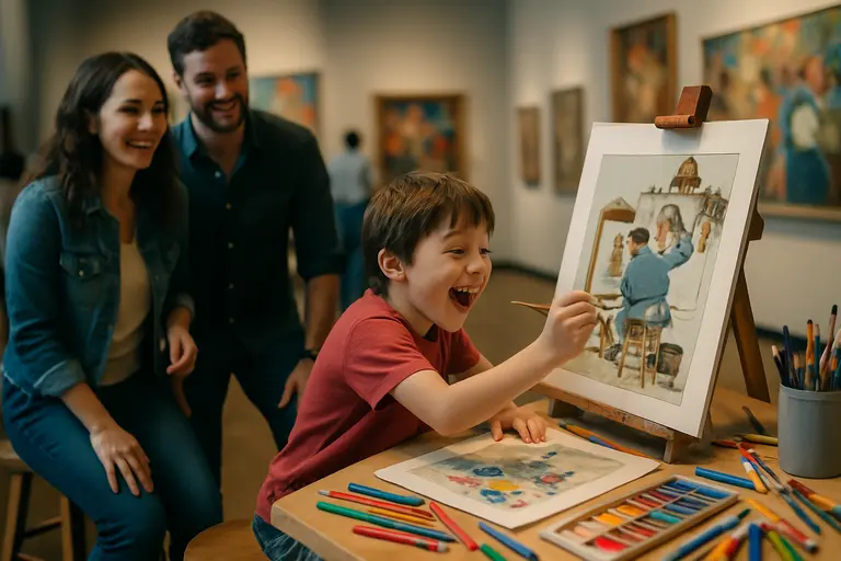
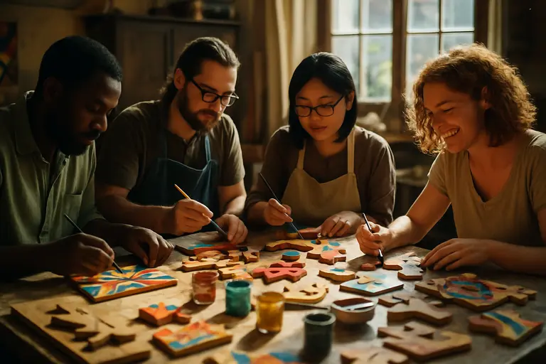
    Visitors arranging artwork reproductions at an interactive museum station

    Reframe/Re-Arrange As A Curatorial Exercise

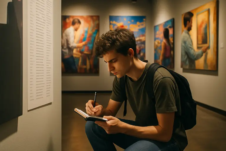
    Reframe/Re-Arrange invited visitors to create their own gallery arrangements using reproductions of works from the permanent collection and loans from Art Bridges Foundation. It also included a community response wall. That is a meaningful choice because it makes interpretation visible. Visitors are not merely asked whether they like a work; they are asked to think like arrangers, editors, and meaning-makers.

    This kind of participation can be especially productive for students and community groups. It shows that curating is not only about placing beautiful objects in a room. It involves sequence, emphasis, comparison, absence, and audience. The museum’s inclusion of a response wall also creates a public record of how viewers process the themes, though the research available here does not provide visitor comments or measurable response data.

    Programs Already Held And Public Context

    The museum paired the exhibitions with programming, including a Director’s Tour on September 19, 2026. Because that date had passed by September 28, 2026, it should be understood retrospectively as part of the season’s public engagement rather than as an event still to come.

    The broader civic angle also reaches beyond museum walls. Arts coverage often sits beside public-life coverage because both ask who is represented and how communities tell shared stories. Readers who follow that wider civic conversation may also recognize related network coverage at a related site in the same network, though the art analysis here rests on The Rockwell Museum’s own published exhibition materials.

    Rockwell Museum Exhibitions And Community Meaning

    Rockwell Museum Exhibitions in fall 2026 are best understood as a coordinated act of institutional self-study. Art at Work looks back to federally supported artists and the social pressures of the New Deal period. Rockwell Reframed uses a director’s selection to test connections among memory, identity, place, and collection growth. Reframe/Re-Arrange hands part of the interpretive process to visitors.

    For Corning and for museum audiences beyond the city, the value lies in that shared structure. These projects do not ask viewers to accept one clean story of American art. They ask viewers to compare frames: public labor, private memory, institutional collecting, community response, and national anniversary narratives. That approach is cautious, but it is not cold. It honors artists by taking their contexts seriously, and it respects communities by treating interpretation as something people can practice together.

  • ByteDance MPA Agreement Tests AI Copyright Guardrails

    ByteDance MPA Agreement Tests AI Copyright Guardrails

    The ByteDance MPA Agreement signed on August 17, 2026, gave the film trade group and the technology company a formal memorandum of understanding around copyright safeguards for ByteDance’s AI video model Seedance and image-generation model Seedream, according to a Reuters report. For artists, studios, sellers, and educators watching AI image and video tools, the agreement matters less as a finished legal answer and more as a sign of where rights governance is being tested.

    The caution is necessary. The memorandum addresses output controls and product safeguards, but the research record does not show that it resolves the harder question of whether copyrighted works were used in training, or whether such use would be lawful. That distinction is especially relevant for visual creators whose work can be referenced, imitated, remixed, or misidentified by generative systems.

    What The ByteDance MPA Agreement Covers

    ByteDance MPA Agreement And Output Controls

    The agreement covers tools offered through major ByteDance services named in the research, including TikTok, CapCut, Dreamina, and the U.S.-designated Seedance and Seedream offerings. ByteDance has released upgraded versions described as Seedream 5.0 Pro and Seedance 2.5, which both parties have said include stronger intellectual property protections. The public record, however, does not provide enough detail to independently evaluate the reliability of those protections across languages, formats, likeness prompts, fan edits, or edge cases.

    The output-layer safeguards described in the research include face-blocking, copyrighted character detection, and C2PA Content Credentials. Those tools point toward a model in which AI companies try to stop certain images or videos before they are generated, shared, or misrepresented. For rights holders, that may reduce some exposure around recognizable characters, performers, and studio-owned scenes. For independent artists, the effect is less clear because many do not have the same catalog-scale detection systems or negotiating power as large entertainment companies.

    From Cease-And-Desist To Memorandum

    The August agreement followed a sharper dispute earlier in 2026. On February 20, 2026, the Motion Picture Association sent ByteDance a cease-and-desist letter targeting Seedance 2.0, alleging that the model had trained on copyrighted works and could generate content featuring characters such as SpongeBob SquarePants and scenes reminiscent of Stranger Things without permission, as reported by Axios. Those allegations should be read as claims in a dispute, not as court findings.

    The shift from cease-and-desist letter to memorandum suggests a negotiated path around some product behavior. It does not show that all rights questions were settled. In that sense, the ByteDance MPA Agreement should be read as a governance instrument: it creates stated safeguards for certain outputs while leaving other legal and ethical questions active.

    Why Output Filters Do Not Settle Training

    Training Data Is The Unresolved Question

    The most significant unresolved issue is training-data liability. The research states that the memorandum does not decide whether training AI models on copyrighted material constitutes infringement. That question is being tested in separate litigation, including Andersen v. Stability AI, which began trial in the Northern District of California on September 8, 2026. As of September 28, 2026, the research supplied here does not establish a final result from that proceeding.

    For creators, this separation between inputs and outputs is not technical trivia. If a system blocks a protected character at the prompt stage, that may reduce one kind of risk. It does not answer whether the system was built using protected works, whether permissions were obtained, or whether a particular training use qualifies as fair use. Those are legal questions beyond the scope of this article, and artists should avoid treating product safeguards as proof of lawful data sourcing.

    Provenance Helps, But It Is Not A License

    C2PA Content Credentials, as referenced in the research, sit in the output-governance category. They can help identify or label generated content when used properly, but the presence of a credential does not by itself grant rights to source material, living performers’ likenesses, or fictional characters. That matters for fashion designers, cosplay makers, illustrators, and marketplace sellers who may be tempted to treat AI-generated imagery as automatically clear for commercial use.

    The safer reading is narrower: provenance and blocking tools can support disclosure and reduce certain misuse. They are not substitutes for rights review, licensing, releases, or creator consent. Similar caution appears in parallel creative industries; our coverage of music copyright rulings has traced how technology, distribution, and liability can change without giving creators simple one-size answers.

    Signals For Artists, Sellers, And Studios

    Independent creator preparing prints and digital artwork at a desk

    Visual Artists And Creator Commerce

    For emerging visual artists, the agreement raises a practical concern: large rights holders may be able to negotiate safeguards directly with AI platforms, while individual creators may have fewer channels to make their work visible to detection systems. That does not mean independent artists have no rights. It does mean that public agreements between major companies may not reflect the needs of illustrators, photographers, costume artists, zine makers, or small studios whose work circulates online without centralized catalogs.

    Creator-commerce sellers should be especially careful with AI outputs that resemble known characters, actors, branded worlds, or living artists’ signature visual approaches. The research does not support any claim that the memorandum gives users permission to generate or sell such material. Sellers on handmade, print, cosplay, and digital-download platforms should treat AI images as material requiring the same rights questions as any other commercial artwork: who owns the source, who is depicted, what references were used, and what permissions are needed?

    Studio Power And Independent Creator Access

    The agreement also shows the influence of organized rights holders. The Motion Picture Association represents major studio interests, and the research describes the memorandum as the first formal agreement between the MPA and an AI company to set copyright guardrails. That may encourage further negotiations between AI developers and large rights groups, but it does not automatically create public standards for every artist, archive, estate, performer, or cultural community.

    That asymmetry deserves scrutiny from arts journalists and educators. A system built around the needs of large catalogs may miss the concerns of folk artists, Indigenous makers, experimental animators, and small creative teams. Any serious discussion of AI safeguards should ask not only whether blockbuster characters are blocked, but whether less powerful creators can report misuse, request review, and understand how their work is treated. Readers comparing creator-rights coverage across the same network can also follow related arts reporting at Robsonic, a related site in the same network.

    ByteDance MPA Agreement For Digital Creators

    What Creators Can Reasonably Take From It

    The ByteDance MPA Agreement gives creators one clear lesson: copyright risk in AI image and video tools is being managed through a mix of private negotiation, product controls, and litigation, not through one settled rule. The memorandum may reduce some output risks around recognizable studio material, but it leaves training practices and broader creator consent unresolved.

    Artists, educators, and sellers can respond by asking precise questions before using AI-generated material in public or commercial settings:

    • Does the tool disclose how it handles copyrighted characters, performer likenesses, and branded scenes?
    • Does the platform provide provenance labeling or content credentials for generated media?
    • Is there a clear process for reporting outputs that appear to copy a protected work or living artist’s identity?
    • Can the user document their own prompts, edits, references, and permissions?
    • Is the intended use educational, editorial, personal, promotional, or commercial?

    None of those questions guarantees legal safety. They do, however, encourage better documentation and more respectful treatment of other creators’ work. For a field built on reference, homage, study, remix, and influence, the distinction between inspiration and unauthorized replication remains ethically significant even when software makes production faster.

    The most cautious reading is that this memorandum is a notable industry signal, not a final settlement of AI copyright. It shows that rights holders can push AI companies toward output safeguards. It also shows why artists outside major studio systems will need clearer disclosure, accessible complaint channels, and stronger public debate about how creative works are used to build commercial AI systems.

  • Daisy Chain Fields And The New Woodstock Echo

    Daisy Chain Fields And The New Woodstock Echo

    Daisy Chain Fields took place on August 29, 2026, at Great Park Live in Irvine, California, and it now sits in recent festival memory as a compact case study in how Woodstock-era ideals are being quoted, revised, and tested by a new generation. Founded by Olivia Rodrigo as a women-led single-day music and art festival, the event was announced with an all-women lineup and a stated emphasis on music, art, and social purpose through the official festival announcement.

    The Woodstock comparison should be handled with care. The 1969 festival has become a cultural shorthand for youth gathering, countercultural art, political feeling, and communal possibility, but shorthand can flatten what actually happened at any festival site. The stronger reading is not that Irvine recreated Woodstock. It is that the event used some familiar materials of festival idealism: intergenerational music, public slogans, folk and punk memory, charity, and a temporary crowd asked to imagine itself as a community.

    Why Daisy Chain Fields Looked Back To Woodstock

    The clearest connection to Woodstock-era memory came through the festival’s use of music as public expression rather than entertainment alone. That distinction matters. A lineup can be all-women and still operate as a standard commercial event; a festival can include political signs and still reduce activism to decoration. The evidence from August 29 points to an event trying to connect both forms, even as practical concerns on the ground complicated that aim.

    Daisy Chain Fields And The Language Of Collective Idealism

    Reports from the festival described roughly 45,000 concertgoers, a major attendance figure for a first edition, along with visual and logistical details that shaped the day’s public meaning, according to CPR’s festival report. The scale matters because a Woodstock reference gains force only when many people are gathered in a shared physical space. Posters, walkways, staging, and overheard chants do not function the same way online as they do when bodies move through heat, lines, sound bleed, and collective attention.

    The festival reportedly drew from 1960s and 1970s counterculture and women’s liberation imagery. That influence appeared in spaces such as a “Wish Tree,” where attendees left messages, and in quoted language from figures including Angela Davis, Audre Lorde, and Maya Angelou painted across walkways. These choices placed text and image in the path of the crowd. They also asked a question that arts organizers know well: does public art deepen a gathering, or does it become a scenic background? At Irvine, the answer seems mixed but serious. The imagery was not incidental to the event’s identity.

    From Lilith Fair To A New Festival Frame

    Festival organizers and artists named Lilith Fair as an influence, which is a more precise precedent than Woodstock in some ways. Lilith Fair’s 1990s model centered women performers and audiences within a touring structure; the Irvine event condensed that logic into one day and paired it with a Gen Z pop headliner whose audience includes many young women. The Woodstock echo, then, came less through exact form and more through the belief that live music could host political feeling, artistic signs, and a crowd-based ethic.

    That distinction helps avoid nostalgia. The festival did not simply borrow flower-power symbols and hope the association would carry the day. Its strongest claim came from the way it linked women-led performance with public messaging and philanthropic commitments. At the same time, the ticketed setting, VIP and pit viewing options, and reported access complaints remind us that countercultural references inside a large commercial event always carry tension.

    Music As Intergenerational Argument

    The lineup placed Rodrigo alongside older and peer-era artists, including Stevie Nicks, Sarah McLachlan, Bikini Kill, The Breeders, Mitski, Doechii, and others. That pairing made the day feel less like a single-genre showcase than a conversation across forms of women-led music. Rock, punk, pop, singer-songwriter traditions, and rap-inflected performance all held space within the same event frame.

    Two Stages, Two Musical Histories

    The reported stage division gave the program a readable structure. The Marigold stage leaned toward rock and punk, with acts such as Bikini Kill and The Breeders associated with that side of the day. The Dandelion stage highlighted pop-influenced and singer-songwriter acts. A two-stage layout can often split audiences by taste; here, it also marked different strands of feminist music memory. Punk’s refusal, folk-pop’s confession, alternative rock’s abrasion, and contemporary pop’s arena-scale emotion all became parts of the same argument.

    That intergenerational programming is where the Woodstock comparison gains its strongest artistic footing. Woodstock is often remembered as a meeting point for sound, politics, fashion, and youth identity. Daisy Chain Fields used a different canon, but it also treated music as a carrier of public values. The appearance of Alanis Morissette during Rodrigo’s finale, as reported in the research notes, fit that structure by placing 1990s confessional rock beside Rodrigo’s contemporary pop-punk lineage.

    Headlining As Community Framing

    Rodrigo’s role as founder and headliner gave the event a clear center, but the all-women or women-led lineup kept that center from becoming the only story. For community organizers, this is a key point: a famous founder can draw attention, while a broad bill can redistribute meaning. The risk is that the founder’s celebrity absorbs the entire event. The opportunity is that celebrity becomes a doorway into artists, causes, and histories that some attendees may not have known deeply before.

    The stronger community outcome depends on what happens after the day ends. Did attendees seek out the older artists? Did younger fans understand the references to women’s liberation and feminist music history? Public data in the research does not answer those questions, so they should remain open. What can be said is that the program gave audiences many points of entry into those histories.

    Art, Protest, And Community Care

    For an arts audience, the most telling feature may have been the festival’s use of visual culture. Protest art at live events often works through repetition: slogans on fabric, handwriting on temporary structures, quoted language on paths, and installations that invite participation. These forms are rarely museum objects, but they shape how people remember a day. They can also create a shared vocabulary among strangers.

    At this event, the “Wish Tree” and walkway quotations suggested a participatory ethic. Visitors were not only receiving a stage program; they moved through a designed field of messages. Some of those messages, including “Free Palestine,” placed the event inside urgent political debate. That choice made the festival’s politics more visible and also more contested. For a closer reading of how those visual choices worked on site, our related Daisy Chain Fields review considers art, protest, and care in more detail.

    The event’s philanthropic claim was also part of its community framing. Research notes state that US$20 million was pledged for distribution among 10 nonprofit organizations working on issues affecting women and girls globally. Because pledged giving can involve timing, administration, and distribution steps after an announcement, it is best described cautiously as a pledge rather than a completed social outcome unless later documentation confirms full disbursement.

    That caution does not diminish the symbolic force of the announcement. In a live-event setting, philanthropy can signal that the gathering is not meant to end at the gate. Yet the practical measure is follow-through: which organizations received funds, when they received them, and how communities described the impact. Those questions require later reporting and should not be assumed from stage language alone.

    The Access Problem Behind The Ideal

    Concertgoers waiting in a sunny line near water and food tents

    Any festival invoking communal care has to be read against its conditions of access. Reports noted heat around 94°F, shortages of shade, long lines for food and water, and complaints about ADA parking and shuttles. Those details are not side notes. They affect who can participate safely and who feels included in the shared space.

    Heat, Lines, And The Ethics Of Gathering

    Outdoor festivals in late August in Southern California carry foreseeable heat risks. A crowd of tens of thousands needs shade, water, food flow, rest areas, and clear mobility support. When those systems strain, the aesthetic language of care meets a material test. Painted walkways and social justice slogans may set a tone, but water access and ADA transport determine whether that tone is felt as real by many attendees.

    This is not a reason to dismiss the festival’s artistic or political ambitions. It is a reason to evaluate them with adult standards. Community is not only declared by the lineup or the charitable pledge; it is built through site planning, staff training, queue design, mobility access, and heat mitigation. A festival can be culturally meaningful and operationally imperfect at the same time.

    Cost And Belonging

    Ticket prices were reported at around US$250 for general admission, with higher costs for VIP or pit viewing. That price point places limits on who could be physically present, even before travel, food, lodging, or accessibility needs are considered. Woodstock mythology often imagines open fields and mass youth participation, but contemporary large-scale events operate within ticketing systems and production budgets that can narrow access.

    For organizers hoping to invoke egalitarian ideals, price is not a minor design choice. It shapes the crowd and the claims a festival can credibly make about community. Future versions, if they occur, would benefit from transparent access strategies, such as clearly described low-cost options, transit planning, shaded rest zones, and detailed ADA communication. That is not legal advice or a production prescription; it is a cultural reading of how values become visible through logistics.

    What Daisy Chain Fields Left Behind

    Daisy Chain Fields left behind a complicated but valuable record: a women-led festival founded by a major pop artist, staged on August 29, 2026, with intergenerational performers, protest-inflected visual culture, and a philanthropic pledge tied to women and girls. It also left behind criticism about heat, lines, and access. Both parts belong in the same account.

    The Woodstock spirit, if the phrase is useful, was not revived as a replica. It appeared as an argument over what a festival can still do: gather strangers, stage music as public feeling, make art part of the grounds, and attach celebration to social claims. The test is whether those ideals can survive the pressures of scale, price, weather, and celebrity. For readers interested in exploring related conversations within the music scene, Robsonic offers insights into how music scenes are not only judged by sound but also by the social spaces they create.

    The most fair assessment is neither romantic nor dismissive. The event showed that a large pop festival can borrow from older protest traditions while centering women-led performance in a way that felt legible to a 2026 audience. It also showed that public ideals require public infrastructure. Daisy Chain Fields will be remembered best if its artistic courage is matched, in any later edition, by stronger care for the people gathered in the field.

  • 90s Americana Aesthetic and Fall 2026 Style

    90s Americana Aesthetic and Fall 2026 Style

    The 90s Americana aesthetic in Fall 2026 fashion was less a single trend than a cluster of references: western wear, varsity cues, workwear, prep, relaxed denim, and late-1990s minimalism. That mix matters because it carries cultural memory as well as retail logic. A plaid shirt, straight-leg jean, baseball cap, or square-neck dress can read as casual, nostalgic, regional, aspirational, or commercial depending on who wears it and how it is framed.

    The strongest evidence points to a revival with measurable interest, but not to a uniform cultural mood. Fashion markets often compress distinct histories into saleable signs. Americana can refer to rodeo dress, campus dress, labor clothing, flag imagery, sportswear, celebrity minimalism, or suburban mall nostalgia. Treating those references as interchangeable risks flattening communities and makers whose dress traditions predate the current retail cycle.

    Why The 90s Americana Aesthetic Returned In 2026

    Demand Signals, Not Certainty

    Business of Fashion reported that global searches for Americana-style keywords such as “western,” “varsity,” and “American flag” had risen fivefold since 2022, while consumer interest grew around cowboy boots, Ivy League prep, and workwear staples, according to BoF’s Americana analysis. That is a useful data point, especially because it connects the trend to search behavior rather than only runway interpretation.

    Still, search growth should be read with restraint. A person searching “western” may be looking for boots, a costume reference, a music event outfit, a vintage belt, or a broader style mood. A person searching “varsity” may be interested in jackets, campus nostalgia, sports culture, or resale. The data confirms attention; it does not, by itself, prove why people are buying, how they style the pieces, or whether the interest will endure beyond the Fall 2026 cycle.

    What Makes The 90s Americana Aesthetic Legible

    The 90s Americana aesthetic becomes recognizable through repeated pieces rather than one strict silhouette. The research notes point to plaid shirts, frontier knits, straight-leg jeans, baseball caps, slouchy sweaters, buckle belts, utility vests, and western-style shirts. These pieces sit between comfort and performance: some suggest labor, some suggest leisure, some suggest school identity, and some suggest a filtered memory of late-1990s casual dress.

    That mixture explains why the style can appear approachable while still carrying tension. Western shirts and buckle belts borrow from regional dress codes. Ivy prep draws on class-coded institutions. Workwear can reference labor while being sold as premium lifestyle clothing. For reviewers, curators, and sellers, the ethical question is not whether these garments can be used. It is whether the presentation acknowledges their origins rather than treating them as empty props.

    Youth Nostalgia And The 1990s Reference Point

    Generational Preference Needs Careful Reading

    YouGov reported March 2025 data showing that 65% of Gen Z and 61% of Millennials said the 1990s were the most fashionable decade, according to YouGov’s style survey. That finding helps explain why 1990s references can feel commercially attractive in 2026. It also shows why nostalgia is not limited to people who personally experienced the decade as adults.

    The 90s Americana aesthetic benefits from that distance. For younger audiences, the decade may be encountered through archived campaigns, celebrity images, resale platforms, television stills, family photographs, and social media mood boards. That can produce sharp styling: simple separates, cleaner shapes, visible denim, leather belts, white shirts, and easy knitwear. It can also produce selective memory, where economic, racial, regional, and labor contexts around American dress fade behind surface appeal.

    Minimalism, Prep, And Celebrity Memory

    The Fall 2026 runway reporting in the research notes described late-1990s minimalism through clean silhouettes, square necklines, simple sheaths, and pared-back staples. It also pointed to renewed interest in Carolyn Bessette Kennedy’s public style vocabulary: pencil skirts, oversized white shirts, undone ponytails, strapless dresses, and preppy basics. Those references are not identical to western or workwear Americana, but they share a period frame and a preference for legible wardrobe pieces.

    This is where cultural reading becomes useful. Minimalism can look neutral, but it is rarely free of signals. A white shirt may suggest polish, nonchalance, office culture, wealth, restraint, or imitation depending on its fabric, fit, and context. A baseball cap can suggest sports culture, anonymity, local loyalty, or celebrity off-duty styling. Fall 2026’s 1990s mood worked because such items could shift meaning quickly.

    Retail Meaning And Creator Commerce

    Independent maker arranging denim, leather belts, and knit samples on a worktable

    Heritage Codes Without Costume

    Retailers and independent sellers have reasons to approach Americana carefully. The research notes identify buckle belts, utility vests, and western-style shirts as standout items in the Fall 2026 retail conversation. Those garments can be styled with respect, but they can also slide into costume if a campaign relies on caricatured rural identity, generic frontier fantasy, or flag imagery without context.

    For creator commerce, the safer cultural path is specificity. A maker selling a hand-knit cardigan inspired by late-1990s proportions can explain fiber, fit, and construction. A seller offering denim styling can name the cut and wash without implying ownership of a regional tradition. Readers comparing denim within the same broader cycle may find a related discussion of denim as everyday dress useful, because jeans often carry the bridge between workwear and casual fashion.

    Rights and likeness issues deserve caution as well. Referencing a decade, a garment type, or a broad mood is different from using a protected character, a living celebrity’s likeness, or brand identifiers in a way that suggests authorization. This is not legal advice, but it is a practical cultural standard: sellers should avoid implying licenses they do not have and should keep inspiration distinct from imitation. Meanwhile, for insights into how style influences extend into other domains, Robsonic provides an intriguing look at the interplay between style, music, and community culture across the network.

    90s Americana Aesthetic After The Fall 2026 Cycle

    What The Revival Revealed

    The 90s Americana aesthetic after the Fall 2026 cycle revealed a market preference for familiar codes that can be rearranged with relative ease. Plaid, denim, knits, caps, boots, white shirts, and pared-back dresses are adaptable. They suit runway styling, resale shopping, independent making, and everyday dressing. That adaptability is why the revival could stretch from western signals to prep and from casual comfort to minimalist polish.

    The more careful reading is that Fall 2026 did not simply bring back the 1990s. It filtered the decade through 2026 concerns: heritage branding, youth nostalgia, creator commerce, comfort, and a hunger for recognizable clothing after cycles of softer minimalism. The strongest outfits were not the ones that treated Americana as a theme party. They were the ones that let materials, proportion, and context carry the reference without erasing where those references came from.

  • NYFW Theatrical Design Meets Local Brass

    NYFW Theatrical Design Meets Local Brass

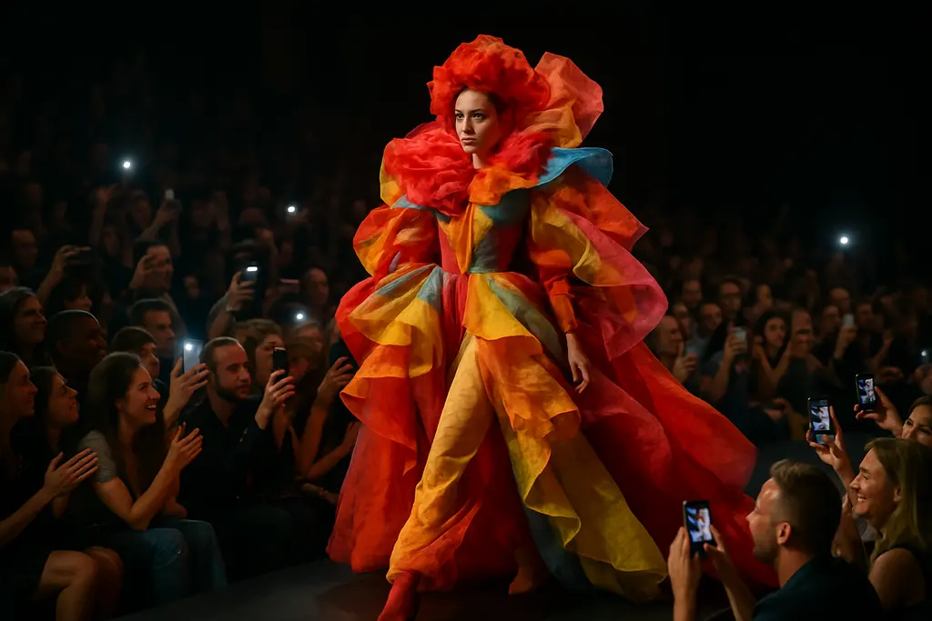
    NYFW Theatrical Design became one of the clearer stories of New York Fashion Week after the September 2026 shows concluded. The strongest examples were not only about scale or surprise. They showed how designers used live music, long runway formats, stage pictures, and off-site locations to create fashion presentations that worked closer to performance than showroom display. That does not mean every show had the same aim, or that spectacle replaced clothing. The evidence points to a narrower reading: several closely watched presentations made sound, movement, and set design part of how the collections were received.

    As a community organizer who pays attention to how art gathers people, I find the local music examples especially meaningful. Brass Queens at Damson Madder and UpBeat NYC at Coach placed musicians inside the emotional structure of the shows. Those appearances also invited a useful question for fashion coverage: when a runway becomes theatrical, who gets seen, and how does the staging frame the artists sharing the space?

    Why NYFW Theatrical Design Centered Performance

    Live Music Gave The Runway A Local Pulse

    The Washington Post’s September 17, 2026 report named Damson Madder and Coach in a tie for “Best use of live music.” At Damson Madder, the local all-female brass band Brass Queens performed at the Soho Playhouse, with covers that included “Pink Pony Club” and TLC’s “Waterfalls.” At Coach, the finale at Pier 36 revealed UpBeat NYC, a live orchestra made up of Bronx-based youth musicians, as dancers appeared and glitter fell from the rafters, according to The Washington Post.

    These details matter because live musicians are not neutral decoration. A brass band changes the pressure in a room: breath, volume, timing, and collective labor become part of the audience’s memory. A youth orchestra at a finale can shift attention from a solitary designer narrative toward a civic one, especially when the musicians are identified as Bronx-based. The reporting does not give enough information to measure audience response, rehearsal time, or compensation, so those points should not be assumed. What can be said is simpler: the shows used identifiable local or youth musical groups, and those choices shaped the theatrical effect.

    How NYFW Theatrical Design Framed Scale

    Scale also appeared through staging rather than sound. Thom Browne’s presentation closed NYFW on September 16, 2026, and used a garden-like set with giant stalks of grass, a leafy canopy, and a glowing cocoon that model Kai Schreiber entered. Khaite presented in a Brooklyn Navy Yard hangar on a runway described as approximately 1,000 feet long, lit by sparse spotlights that made models pass in and out of visibility. The New York Times connected both shows to performance-led presentation in its report, Clothes That Perform.

    Those two examples used very different stage languages. Browne’s garden imagery leaned toward fantasy and narrative theatre. Khaite’s long runway and shifting visibility created a colder, more architectural rhythm. Leather, lace, florals, and sheer layering were prominent at Khaite, but the conditions of viewing also mattered. A model moving through shadow and light changes how fabric is read. Texture becomes partial. Shape arrives, disappears, and returns. Taken together, NYFW Theatrical Design did not refer to one aesthetic. It described several methods for controlling attention.

    What The September 2026 Shows Revealed

    Opening Heat, Scarves, And Softened Silhouettes

    Not every memorable moment depended on a huge set. Ralph Lauren’s Spring/Summer 2027 show officially opened NYFW on a Wednesday in early September 2026. The front row included Meghann Fahy, Elizabeth Debicki, and Cynthia Erivo, who were reported wearing fall-2026 styles such as wool pullovers and velvet blazers in 82-degree weather. That detail reads as a small but telling stage picture: seasonal fashion, celebrity visibility, and physical discomfort all present at once.

    Other examples worked through material gestures. DVF, under new artistic director Henry Zankov in his debut season, distributed silk scarves in purple, blue, green, and red as part of the show notes. Attendees used those scarves through the week as accessories. Kate Hundley, after 14 seasons associated with “strong, smart” clothes, showed softer versions of her leather silhouettes through satin and mesh while retaining strong shapes. These details are quieter than falling glitter or a glowing cocoon, yet they still speak to presentation. A scarf passed from show note to worn object can travel through a week as a visual marker. A softened silhouette can mark change without rejecting a designer’s established language.

    Off-Site Energy At Storm King

    Collina Strada’s show took place away from the city’s usual fashion-week rooms, at Storm King Art Center in New Windsor, New York. The presentation developed a dance-party atmosphere and included a live performance by Carly Rae Jepsen. Since Storm King is known as an art center rather than a conventional runway venue, the setting likely affected how audiences perceived the clothes and performance. The available research, however, does not provide enough detail to claim how the outdoor art setting changed the collection’s meaning. A cautious reading is better: the off-site choice placed fashion beside art-space conditions and live pop performance, making the event feel less like a standard runway slot.

    For readers tracking culture across music, costume, visual art, and public gathering, that placement is significant. Fashion weeks often serve industry functions, but they also produce temporary communities: musicians, dancers, models, stylists, photographers, editors, craftspeople, venue workers, and guests share a compressed public moment. A related arts-and-culture network such as Robsonic provides a useful context because it highlights how these fashion events situate between creative spheres rather than conforming to a single discipline alone.

    Reading Spectacle Without Overstating It

    Audience members watching a staged fashion presentation

    What The Evidence Supports

    The available reporting supports a clear but limited claim: NYFW in September 2026 included several high-profile uses of theatrical staging and live performance. Damson Madder and Coach used live music with identified groups. Thom Browne closed the week with an elaborate garden-like set and cocoon image. Khaite used an unusually long runway in a hangar, with lighting that made visibility unstable. Collina Strada moved to Storm King and included a live pop performance.

    What the evidence does not support is just as important. The research does not give a count of how many NYFW shows used live music. It does not provide budgets for sets, rehearsal details, artist fees, or audience survey data. It also does not prove a permanent industry shift. Cultural coverage is strongest when it resists turning a few striking examples into a broad trend without numbers. The better conclusion is that the reported highlights show a concentrated use of performance tools across several notable presentations during the September 2026 schedule.

    • Brass Queens brought live brass-band performance to Damson Madder at the Soho Playhouse.
    • UpBeat NYC added youth-orchestra presence to Coach’s finale at Pier 36.
    • Thom Browne used an immersive garden image to close NYFW on September 16, 2026.
    • Khaite used distance, shadow, and a Brooklyn Navy Yard hangar to alter how garments were seen.

    NYFW Theatrical Design, Brass Bands, And Community Memory

    Why These Moments Last Beyond The Runway

    The clearest lesson from NYFW Theatrical Design in September 2026 is that performance can make a runway easier to remember, but it also creates obligations for critics. We should name musicians when reporting allows it. We should distinguish between local cultural participation and anonymous atmosphere. We should avoid treating community performers as props, especially when a show’s emotional force depends on their labor.

    That is why the Brass Queens and UpBeat NYC examples deserve attention beside Thom Browne’s garden staging and Khaite’s long runway. Theatrical design is not only scenery. It is also the human energy that enters the room through breath, choreography, timing, and sound. For a fashion week that ended on September 16, 2026, the most persuasive highlights were the ones that made design feel social: clothes moving through music, performers sharing the frame, and audiences asked to read fashion as a live cultural event rather than a still image.

  • Geometries Exhibition at Studio Museum Harlem

    Geometries Exhibition at Studio Museum Harlem

    The Geometries Exhibition at the Studio Museum in Harlem is no longer an upcoming listing; it opened on September 10, 2026, and remains on view through January 31, 2027. That timing matters because the show now sits inside the lived rhythm of Harlem’s fall arts calendar rather than in advance publicity. Organized by Thelma Golden, the museum’s Ford Foundation Director and Chief Curator, with Curatorial Assistant Simon Ghebreyesus, the exhibition asks how lines, shapes, grids, and spatial systems can carry questions of identity, feeling, tradition, and art history.

    For community organizers, artists, educators, and gallery-goers, the exhibition offers a focused case study in how abstraction can be socially and historically charged without losing formal force. Geometry is often discussed as if it belongs to neutrality, order, or pure visual structure. The Studio Museum’s framing complicates that assumption by centering Black artists who use geometry to test modernism, extend African and diasporic references, and make room for spiritual, emotional, and bodily presence.

    Why Geometries Exhibition Matters Now

    The Geometries Exhibition As Inquiry

    The Geometries Exhibition is grounded in an old discipline: the mathematical study of forms, relations, and space. Yet the show treats geometry less as a fixed language than as a field of artistic inquiry. In that sense, the exhibition joins a longer argument in modern and contemporary art: abstraction is never automatically detached from the world. A grid can suggest architecture, memory, constraint, mapping, migration, discipline, rupture, or prayer, depending on the artist’s method and context.

    The museum’s fall 2026 season announcement places the exhibition within a larger institutional moment: the close of the Studio Museum’s inaugural year in its new 82,000-square-foot building and a program that draws on a permanent collection representing works by more than 800 artists, according to the museum’s fall 2026 season release. That setting gives the show weight beyond a single gallery presentation. It also connects the exhibition to the museum’s mission of centering artists of African descent locally, nationally, and internationally.

    Dates, Place, And Institutional Context

    The exhibition is presented at the Studio Museum in Harlem, 144 West 125th Street, in New York. Its dates overlap with other fall and winter programming at the museum, including Dreams of This Future: The Collection of Peggy Cooper Cafritz, on view from August 19, 2026, to February 28, 2027, and Kapwani Kiwanga: BLEED, on view through April 1, 2027. This overlap is useful for interpretation because it places geometric abstraction near collection-based, conceptual, and material inquiries rather than isolating it as a closed art-historical category.

    Across New York cultural institutions, fall 2026 has also brought attention to how museums frame place, inheritance, and community voice. For readers comparing institutional approaches, the Museum of the City of New York’s Halumii Ktapihna preview offers a related but distinct example, with Lenape artists and homelands at its center. The comparison should be made carefully: these are different communities, histories, and curatorial premises. Still, both show how cultural institutions can place art in dialogue with living identity rather than treating it as background decoration.

    How Form Carries Identity And Tradition

    Against The Myth Of Pure Abstraction

    One of the most significant ideas in the Studio Museum’s framing is that the exhibition interrogates Western geometric abstraction and its claim to purity. That is a cautious but meaningful claim. It does not require viewers to reject formal analysis; instead, it asks them to notice what formal analysis can miss. A line may be compositional, but it may also mark separation. A repeated pattern may be visual rhythm, but it may also invoke labor, textile traditions, architecture, coded memory, or ritual order.

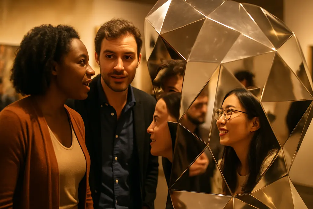
    The Geometries Exhibition includes artists whose practices have very different relationships to abstraction. The research notes identify Julie Mehretu, Alma Thomas, Jack Whitten, William T. Williams, Loretta Pettway Bennett, McArthur Binion, Sonia Boyce, Torkwase Dyson, and Rico Gatson among many others. That range suggests that the show is not making a single argument about what geometry means. It appears to be assembling multiple arguments: geometry as structure, geometry as pressure, geometry as ornament, geometry as history, and geometry as a way to push against restrictive definitions of modernism.

    African And Diasporic References

    The exhibition’s stated attention to African artistic traditions and spiritual forms is especially important. In many museum settings, geometry has been presented through a narrow European and American modernist story. The Studio Museum’s approach, as described in the research, places Black artistic production at the center of the question. That shift affects how viewers might read repetition, symmetry, fragmentation, scale, and pattern.

    There is a community dimension here as well. Harlem is not a neutral backdrop for the Studio Museum. The museum’s public identity has long been tied to artists of African descent and to a neighborhood where art, politics, education, and daily life meet. For readers who follow cultural writing across related arts and community sites, the website Robsonic presents itself as part of the same network dedicated to nurturing creative life. The point is not to flatten different art scenes into one story, but to keep asking how exhibitions are received by the people and places around them.

    Reading The Artist List With Care

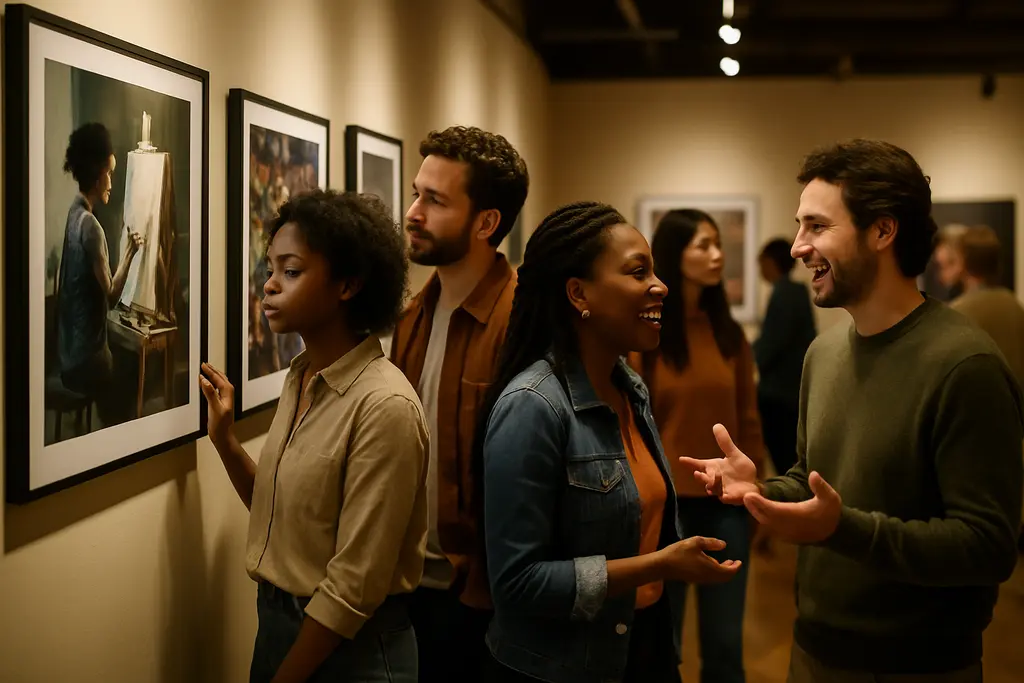
    Museum visitor pausing before a large abstract painting with layered forms

    Why A Broad Roster Matters

    The artist list identified in the research points to a wide curatorial frame. Alma Thomas, for instance, is often discussed through color, rhythm, and abstraction; Jack Whitten through process, material, and experimental surfaces; Julie Mehretu through layered mapping, architecture, and dense spatial movement. Those brief associations are not substitutes for the works themselves, but they indicate why geometry can function as a shared question rather than a shared style.

    That distinction matters. Group exhibitions can sometimes encourage viewers to look for sameness. A stronger reading asks what tensions appear between works. Does one artist use geometry to stabilize the picture plane while another uses it to fracture space? Does pattern invite contemplation in one work and unease in another? Does a grid behave like a modernist device, a memory system, an architectural plan, or a social diagram? The Geometries Exhibition seems designed to reward those slower comparisons.

    Careful Claims About Influence

    Because the exhibition brings together artists from different generations and practices, influence should not be overstated. It would be too simple to say that each artist is responding to the same tradition in the same way. The safer and more useful claim is that the exhibition gathers works that use geometric strategies to ask related questions about form, identity, tradition, and modernism.

    That caution also respects the artists. No artist should be reduced to an example of a theme, even in a tightly organized show. The curatorial premise can open a door, but each work still needs to be met on its own terms: scale, material, date, placement, surface, and visual pressure all shape meaning. A visitor who starts with the theme and then returns to the object may come away with a more grounded experience than one who treats the wall text as the full argument.

    • Dates: September 10, 2026, through January 31, 2027.
    • Venue: Studio Museum in Harlem, 144 West 125th Street, New York.
    • Curators: Thelma Golden and Simon Ghebreyesus.
    • Central frame: geometry as artistic inquiry, not only as visual order.

    Geometries Exhibition At Studio Museum Harlem

    What The Show Adds To Harlem’s Fall Season

    The Geometries Exhibition adds an intellectually demanding but accessible entry point into the Studio Museum’s fall 2026 program. Its subject may sound formal at first, yet the exhibition’s stated concerns are deeply human: identity, emotion, tradition, spiritual form, figuration, and the limits of inherited art-historical categories. That combination makes it especially useful for educators, artists, and community groups interested in how abstraction can speak without becoming didactic.

    As of September 28, 2026, the exhibition is ongoing, so any assessment remains provisional. The strongest reading at this point is that the show asks viewers to reconsider a familiar art term. Geometry, in this context, is not merely a matter of shapes arranged well. It is a way to think about relation, inheritance, structure, pressure, and possibility. For a museum centered on artists of African descent, that is not a side question. It is part of how art history gets revised in public, one room and one encounter at a time.

  • OBJECTS: USA Returns To American Craft In 2026

    OBJECTS: USA Returns To American Craft In 2026

    The return of OBJECTS: USA is not only an exhibition revival; it is a test of how American craft is read after more than five decades of debate about material, function, authorship, and cultural value. The San Francisco presentation opened at the Museum of Craft and Design on September 5, 2026, and is scheduled to run through January 17, 2027. That timing matters. As of September 28, 2026, the show is no longer a preview or promise. It is now a live case study in how a 1969 craft statement can be reassembled for an audience shaped by studio craft, design culture, museum collecting, and maker economies.

    For community organizers and arts readers, the exhibition offers a useful question: what happens when craft is framed not as a secondary category beside painting and sculpture, but as a central form of cultural thinking? The answer cannot be reduced to nostalgia. The research notes describe a smaller 2026 presentation of more than 70 works, pairing artists associated with the original exhibition with contemporary makers. That curatorial choice invites comparison without pretending that 1969 and 2026 share the same artistic conditions.

    Why OBJECTS: USA Still Matters

    The 1969 OBJECTS: USA Benchmark

    OBJECTS: USA opened on October 3, 1969, at the Smithsonian National Collection of Fine Arts, now the Smithsonian American Art Museum, in Washington, D.C. Smithsonian architectural history. The original exhibition was organized by art dealer Lee Nordness and curator Paul J. Smith, with sponsorship from SC Johnson & Son. According to Smithsonian Magazine, it included more than 500 works by 308 artists, with materials including clay, fiber, glass, wood, enamel, metal, and mosaic Smithsonian Magazine account.

    Those numbers alone explain part of the exhibition’s force. A show of that scale did not present craft as a minor decorative side note. It gave artists working with vessels, furniture, jewelry, fiber, and object-making a museum-scale platform. By that measure, OBJECTS: USA gave craft a public seriousness that still shapes how museums and audiences talk about handmade and materially inventive work.

    Material Respect Over Category Policing

    The strongest historical claim supported by the research is that the exhibition blurred the line between fine art and craft. That does not mean every object became interchangeable with painting or sculpture. It means the show asked viewers to judge utility, surface, structure, skill, and concept together. A chair, vessel, necklace, or woven object could carry aesthetic force without needing to disown use, touch, or domestic association.

    This point is central to contemporary craft criticism. Craft objects are often read through labor and material knowledge before they are read through market category. That can be a strength, but it can also lead to under-reading the conceptual work in a piece. The 1969 exhibition challenged that habit by treating material practice as an art language, not merely a production method.

    The 2026 San Francisco Presentation

    How The New Selection Changes The Scale

    The 2026 OBJECTS: USA presentation at the Museum of Craft and Design is far smaller than the original. The research notes describe more than 70 works, compared with the 1969 exhibition’s more than 500. That reduction changes the viewing experience. A broad national survey can imply abundance and scope; a smaller selection can sharpen comparison. It may allow the exhibition to operate less as an encyclopedic statement and more as a concentrated argument about continuity, contrast, and inheritance.

    The artist group described in the research notes brings together figures connected to the earlier show, including Wendell Castle, George Nakashima, Art Smith, and Marguerite Wildenhain, with contemporary makers such as the Haas Brothers, Roberto Lugo, Tanya Aguiñiga, Nicole Cherubini, Jolie Ngo, Amber Cowan, Jay Sae Jung Oh, and Joyce Lin. The value of that pairing lies in the gap between them. The older works can show how studio craft gained public recognition in the late 1960s. The newer works can suggest how material practice now intersects with identity, design, found materials, digital-era fabrication habits, and expanded ideas of function.

    Materials As Evidence, Not Ornament

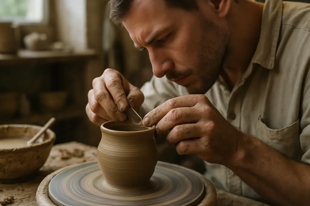
    The research notes identify fiber, terracotta, glass, wood, stoneware, mixed media, and found-object assemblage among the materials in the San Francisco exhibition. That range should not be treated as a checklist of attractive surfaces. In craft, material is often evidence. It shows training, bodily knowledge, regional practice, resource choices, and the artist’s relationship to durability, fragility, repair, and use.

    For viewers, this calls for slower looking. A ceramic surface can register firing decisions and hand pressure. A wood form can hold design history and a maker’s response to grain. Found-object assemblage can carry social meaning through previous use. Fiber can connect domestic labor, sculpture, fashion, and architecture. None of these readings requires inflated claims. They ask for attention to what the object is doing materially and culturally.

    Craft, Community, And Cultural Memory

    Visitors studying handmade objects in a quiet museum gallery

    Why Community Context Changes The Reading

    Craft exhibitions often speak to communities beyond the museum: teachers, studio artists, guilds, designers, collectors, family makers, and visitors who understand making through lived practice. That breadth can make craft unusually public. A person who has thrown clay, repaired furniture, stitched cloth, or assembled objects at home may bring a physical understanding to the gallery. The exhibition’s connection to Handwork: Celebrating American Craft 2026, described in the research notes as a year-long Craft in America initiative, places the San Francisco show inside a larger national conversation about traditional and emerging craft practices.

    That context matters because craft is frequently sustained by networks: workshops, community studios, schools, apprenticeship patterns, local markets, and museum programs. A show like this can validate those networks without romanticizing them. It can also raise harder questions. Which makers are preserved in museum memory? Which forms of labor are celebrated? Which communities gain institutional visibility, and which remain outside the frame?

    Reading Craft Across Arts Coverage

    In seeking to connect broader cultural perspectives, readers who follow exhibitions as part of wider cultural life might find Robsonic arts writing beneficial. This analysis can complement discussions on American place and identity, like those in exhibitions such as Andrew Edlin’s American place show, which engage with how objects and images convey social meaning.

    The caution is to avoid making the 2026 exhibition stand for all American craft. The research supports a more modest reading: this is a selected contemporary response to a historically influential exhibition. It is meaningful because of its lineage, its material range, and its artist pairings, not because it can settle every question about craft’s place in museums.

    What OBJECTS: USA Means For Craft Communities

    A Living Argument About Value

    What makes OBJECTS: USA useful in 2026 is not simply that it returned. Its value lies in how it keeps an argument active. Craft has long been asked to justify itself against fine art categories, commercial design, domestic use, and decorative reputation. The exhibition’s history gives contemporary viewers a way to see those pressures rather than accept them as natural.

    For artists, the show can be read as an acknowledgment that material intelligence is intellectual work. For museums, it is a reminder that collecting and exhibiting craft means more than displaying beautiful things. It requires attention to process, community, function, and the social meanings carried by materials. For audiences, it offers a practical way to look: start with the object, then ask how its material, use, form, and cultural setting shape one another.

    As a community organizer, I find that craft exhibitions often build unusually generous conversations because people enter them through both knowledge and memory. Some visitors know the named artists. Others know the feeling of making, mending, shaping, or handling materials. The San Francisco presentation benefits from that shared ground. It asks viewers to respect the object not as a lesser art form, but as a site where skill, imagination, and community life meet in physical form.

  • Much Here Is Beautiful at SAAM: Photo Survey

    Much Here Is Beautiful at SAAM: Photo Survey

    Much Here Is Beautiful arrives at the Smithsonian American Art Museum as a focused look at photography surveys funded around the U.S. Bicentennial, with the exhibition now on view after opening on September 18, 2026. For readers who follow museum programming as civic culture rather than only as art display, the show is notable for its scale, its public funding context, and its attention to how photographers recorded people, communities, and places across the United States during a period of national self-examination.

    The available record supports a careful reading rather than an inflated one. The exhibition is scheduled to remain on view through April 18, 2027, with free admission and no timed passes required; the Smithsonian lists daily museum hours as 11:30 a.m. to 7:00 p.m. on its Smithsonian exhibitions listing. That access model matters because the exhibition’s subject is itself tied to public arts infrastructure: National Endowment for the Arts support for photographic survey work in the years around 1976.

    Much Here Is Beautiful And The Bicentennial Lens

    Much Here Is Beautiful In Scope

    The most useful way to approach Much Here Is Beautiful is not as a single-artist exhibition, but as a survey of surveys. The research record states that more than 70 photographic survey projects were funded by the NEA in the years surrounding the U.S. Bicentennial, mostly from the 1970s into the early 1980s. Those projects involved more than 200 photographers and produced thousands of photographs. SAAM’s presentation draws attention to that larger archive while giving museum visitors a selected route through it.

    SAAM’s holdings include 1,000 photographs transferred from the NEA in 1983, including prints from 13 survey projects. The exhibition centers on 225 photographs selected for display, drawn from the museum’s NEA-survey holdings and from newly discovered collections across the country. Those numbers are significant, but they should be read with care. A display of 225 works can suggest range; it cannot stand in for every community, photographer, or local archive touched by the original surveys.

    Why The NEA Surveys Matter

    The Bicentennial context gives the exhibition its sharper question: how does a nation picture itself when public culture asks for commemoration? Photography, unlike a monument or parade, often holds contradiction in the same frame. It can register pride, labor, displacement, ordinary social life, housing, rural space, urban change, and the small gestures by which people claim belonging. The exhibition’s premise, as supported by the research notes, is that these NEA-funded surveys were not only celebratory records. They were also documentary acts shaped by time, place, funding, and the judgment of individual photographers.

    That distinction matters for respectful criticism. Communities photographed for public projects are not raw material; they are the social ground of the work. The ethical viewing position is to ask what each photograph shows, what it withholds, and who had control over the terms of representation. The exhibition’s value lies partly in inviting those questions without requiring every image to carry the same civic message.

    What The Smithsonian Presentation Supports

    Dates, Access, And Published Record

    The show is accompanied by a fully illustrated catalogue published in 2026 by Radius Books and listed at US$65. The Smithsonian American Art Museum describes the volume as including histories of all 72 NEA photo survey projects, along with hundreds of image reproductions, on the museum’s catalogue page. For visitors, researchers, and photography educators, that publication may be as important as the gallery installation because it can preserve project-level context beyond the exhibition dates.

    The curatorial frame is also part of the evidence. The exhibition is curated by John P. Jacob, McEvoy Family Senior Curator for Photography, and Krystle Stricklin, Assistant Curator of Photography. Their selection is not neutral in the abstract; no exhibition selection is. It is a shaped argument about which images, projects, and archival rediscoveries help viewers understand the Bicentennial-era surveys now.

    A Cautious Reading Of Scale

    Several figures give the exhibition weight: more than 70 projects, over 200 photographers, thousands of photographs, 1,000 works transferred to SAAM in 1983, and 225 images on view. Yet scale should not be mistaken for total coverage. The research notes identify subjects ranging from the California coast to Kansas to New York City, and works spanning from the 19th century through the early 1980s. That spread suggests a broad historical field, but it does not mean the exhibition can represent every region or community with equal depth.

    • The exhibition opened on September 18, 2026, and is scheduled through April 18, 2027.
    • Admission is free, and no timed passes are required according to Smithsonian exhibition information.
    • The display centers on 225 photographs selected from SAAM holdings and collections found nationwide.
    • The catalogue documents all 72 NEA photo survey projects identified in the research record.

    For readers comparing arts coverage across related cultural sites like Robsonic, this is the kind of exhibition that benefits from slow description rather than quick ranking. The work sits at the meeting point of documentary photography, public funding, regional memory, and museum interpretation.

    Community Portraiture And National Memory

    Documentary photographs showing neighborhood streets and community scenes

    East Baltimore As A Case Study

    One highlighted project in the research notes is “Welcome Home: A Portrait of East Baltimore, 1975-1980,” led by Elinor Cahn, Joan Clark Netherwood, and Linda Rich. It is described as one of the more acclaimed NEA projects at the national level. Even without assigning more claims than the record supports, its inclusion points toward a key issue in the exhibition: the difference between photographing a place and building a sustained portrait of community life.

    A project title such as “Welcome Home” signals intimacy, but titles alone cannot establish trust, method, or reception. Viewers should look for evidence inside the images and in the museum labels: repeated presence, domestic settings, street-level observation, social gathering, and the way subjects meet or refuse the camera. A strong community portrait rarely depends on a single defining image. It gains force through accumulation, relation, and attention to ordinary time.

    Photography As Public Memory

    Much Here Is Beautiful is also a study in how public memory is assembled after the fact. The photographs came from a period near the Bicentennial, but the museum presentation is taking place five decades later. That gap changes the viewing conditions. Images once connected to near-present documentation now carry archival weight. Clothing, storefronts, signs, streets, interiors, and modes of public gathering can read as historical evidence, while still remaining works made through artistic decisions.

    This is where event reviewing and art criticism meet. A museum exhibition is not only a room of objects; it is a public encounter staged through selection, wall text, publication, access policy, and audience movement. Because admission is free and no timed passes are required, the institution lowers one barrier to entry. That does not solve every access issue, but it is a meaningful condition for an exhibition concerned with public arts funding and national self-representation.

    Much Here Is Beautiful For Contemporary Viewers

    Much Here Is Beautiful asks contemporary viewers to spend time with photographs made under civic pressure: a national anniversary, public funding, and the hope that images could record something durable about American life. The most cautious reading is also the most productive one. The exhibition does not need to be treated as a full portrait of the United States to be valuable. Its strength rests in showing how many partial portraits were made, preserved, transferred, rediscovered, and reinterpreted.

    For visitors who care about photography, the exhibition offers a concentrated case study in survey work. For those drawn to festivals, public art, and community documentation, it raises questions about who gets pictured during official moments of commemoration. For artists and independent sellers who work with archival influence, it is also a reminder to separate inspiration from appropriation and to treat people, places, and historical images with care. The supported facts point to an exhibition with clear dates, free public access, a substantial catalogue, and a broad archival foundation. The interpretive work begins from there.

  • Connections Sports Edition: Why Sports Knowledge Is Only Half The Puzzle

    Connections Sports Edition: Why Sports Knowledge Is Only Half The Puzzle

    Connections: Sports Edition turns sports knowledge into a sorting challenge rather than a conventional trivia quiz. Published by The Athletic, the daily game asks players to organize 16 terms into four connected groups. The official Connections rules confirm that the sports version uses the original game’s core format: one intended solution, with terms that can appear to fit several categories.

    The interesting challenge is deciding which connection matters, not simply recognizing a familiar name. For readers following NextClues’ entertainment coverage, that makes the game a useful meeting point between puzzle solving and fan conversation. This guide explains an approach to the format without reproducing a published board or revealing today’s answers.

    Why Recognizing A Name Does Not Solve The Category

    In a February 17, 2025 puzzle editor interview, Mark Cooper described combining sports trivia with wordplay. He discussed looking for terms with multiple meanings and creating categories that reward different kinds of knowledge. That editorial approach helps explain why familiarity with a sport does not settle every grouping.

    Recognition answers one question: what does this term refer to? Classification asks another: what exact property links it to three other entries? A player might correctly recognize every name in a proposed group yet connect them for the wrong reason. The useful habit is to explain the relationship before selecting the tiles.

    Treat the sport itself as a starting hypothesis rather than a finished category. Four entries associated with the same competition might share a more precise connection, or one might belong elsewhere through its wording. Ask whether your explanation applies equally to every entry. A category that needs a different justification for each member deserves another look.

    For a mixed group of solvers, this creates room for different contributions. One person can supply a factual association; another can question the category’s wording. Neither contribution needs to become a contest over who is the more committed fan.

    Read The Whole Board Before Committing

    The game allows four mistakes, giving speculative submissions a real cost within the puzzle. Cooper’s interview describes the same four-groups-of-four structure and mistake limit. A useful response is to separate noticing a possible connection from deciding that it is ready to submit.

    Start by reading every entry. Form candidate groups mentally or in a private note, then check each proposed fourth member. Avoid submitting three convincing matches with a fourth selected merely to complete the set. Ask what evidence makes that final term belong under the same definition.

    Next, examine what your proposed group leaves behind. If removing four entries would break another unusually precise connection, keep both possibilities open. This is a reasoning exercise, not a guaranteed solving formula: the point is to compare competing explanations before spending a mistake.

    A failed submission should lead to a revised idea. Replacing one tile without questioning the category may repeat the same error. Reconsider whether the link is too broad, whether a term has another meaning, or whether you have mistaken a shared association for the intended relationship. Slow the next decision down rather than trying to recover through speed.

    Use Difficulty Colors As Context, Not A Verdict

    The New York Times’ difficulty guidance assigns category colors from yellow, the easiest, through green and blue to purple, the trickiest. Treat those labels as editorial context rather than a personal assessment of your sports knowledge.

    A category tied to a familiar interest may feel straightforward to you and obscure to someone else. A wordplay connection may reverse that experience. There is little practical value in arguing that a category should have been easy after the answer is visible. The better question is what prevented you from recognizing its structure.

    After finishing, distinguish a knowledge gap from an interpretation error. Did you lack a relevant fact, overlook a second meaning, or commit to a category before testing all four entries? Each explanation suggests a different adjustment for the next session.

    Keep that review brief. Write down one lesson about your approach rather than collecting answers to memorize. For example, you might decide to check alternate meanings before submitting a group of familiar names. That is a reusable habit without pretending that every future puzzle will follow the same pattern.

    Give Everyone A Role In Shared Play

    For an informal watch-party session, choose a moment when guests can give the board their attention. Invite participation rather than making the puzzle a compulsory test. A shared screen works best when everyone can read the entries and nobody submits a guess before the group has heard its explanation.

    Agree on a simple house rule: the person proposing a group states the connection, another person tests the weakest match, and the person controlling the screen waits for agreement. These are suggestions for collaborative play, not extra rules imposed by The Athletic. Their purpose is to prevent one fast solver from making every decision.

    Keep the distinction between play and wagering clear. Adults researching Alabama sports betting legal updates are dealing with a separate regulatory topic, not an extra layer of puzzle strategy. That linked commercial guide is not an official regulator, and a shared word-game session needs no financial stakes.

    Let anyone who has already solved the board act as a facilitator rather than a contestant. They can invite quieter players to explain an idea without supplying the answer. If someone would rather watch the broadcast, leave that choice open. The activity should add a conversation, not replace the gathering’s original purpose.

    Set Spoiler Boundaries Before Sharing

    The New York Times Help Center identifies Connections Coach as the Sports Edition’s community forum. A discussion space can be useful after an attempt, but its existence should not be read as a promise that every comment will preserve the puzzle’s surprises.

    Before giving a hint, ask what kind of help the other person wants. A prompt to reconsider a word’s meaning leaves more work for the solver than naming the category. Supplying the complete group removes that work altogether. Let the recipient choose how far the explanation goes.

    Use separate spaces for general reactions and answer discussion. A message about finding a board difficult does not need a screenshot of the completed categories attached. In a group chat, label answer discussion clearly and keep revealing details out of the opening line, where a notification preview could expose them.

    For your own post-game conversation, focus on reasoning. Explain why you abandoned an early hypothesis or which assumption made a connection harder to see. That approach gives other players something to discuss without turning every exchange into a pasted solution sheet.

    Check The Edition Before Following A Guide

    Sports Edition and standard Connections share a format, but their supporting features are not interchangeable. The Sports Edition access guidance lists web access, The Athletic app, and the NYT News app, and states that Sports Edition does not have an archive. Check the relevant product documentation before assuming a feature described for the original game applies here.

    Use that same care when choosing a walkthrough. Prefer one that identifies the edition, explains its spoiler level, and separates official rules from the writer’s suggested tactics. Avoid opening an answer-led page when all you need is clarification of the format.

    For your next session, choose one concrete experiment: read the entire board before selecting, state each category in a single sentence, or invite another solver to challenge the fourth entry. Afterward, decide whether that change improved your reasoning. The aim is a more satisfying attempt at the next puzzle, not a promise of a perfect streak.

  • Macy’s Capsule Collection Backs U.S. Talent

    Macy’s Capsule Collection Backs U.S. Talent

    Macy’s Capsule Collection officially launched on September 8, 2026, as part of Macy’s Fall “Find Us at Macy’s” campaign, according to the company announcement carried by Business Wire via StreetInsider. As of September 22, 2026, the collections are live online and in selected stores. The premise is direct but layered: combine established American fashion names with newer designers, sell limited-edition capsules through Macy’s channels, and use store programming to make the campaign feel less like a standard seasonal product push.

    That strategy deserves a careful reading because capsule collections can do different kinds of work. They can create scarcity, refresh a retailer’s fashion authority, introduce shoppers to labels they may not have followed, and give designers access to a wider national audience. None of those outcomes is automatic. The strength of this campaign depends on whether Macy’s can support discovery without flattening the identities of the participating designers into a single house style.

    How Macy’s Capsule Collection Frames American Design

    Why The Icons And New Guard Pairing Matters

    Macy’s has organized the project around six American designers in two groups: “The Icons,” made up of Tommy Hilfiger, Donna Karan, and Michael Kors, and “The New Guard,” made up of Jonathan Cohen, Sally LaPointe’s LaPointe, and Edvin Thompson’s Theophilio. FashionUnited reported that each designer created limited-edition capsules sold exclusively through Macy’s, in selected physical stores and through macys.com, as part of the Fall 2026 campaign FashionUnited.

    The split between icons and newer labels is not just a branding device. It gives Macy’s a way to frame American design as both recognizable and still in motion. Hilfiger, Karan, and Kors bring broad public familiarity. Cohen, LaPointe, and Theophilio represent a more discovery-driven side of the project, where the value for shoppers may be less about name recognition and more about encountering a designer point of view inside a large retail setting.

    For a department store, that balance is meaningful. Too much emphasis on familiar names can make a campaign feel safe. Too much emphasis on discovery without context can leave shoppers unsure why the collaboration matters. Macy’s appears to be using the two-tier structure to manage that tension, placing less familiar labels beside names with long-standing visibility in American fashion.

    Macy’s Capsule Collection As A Discovery Tool

    Macy’s Capsule Collection is less persuasive if viewed only as a product drop. Its stronger community and culture argument is that a national retailer can act as a bridge between designer identity and public access. For emerging or newer labels, shelf space and homepage placement through a major retailer can expand reach beyond runway coverage, specialty boutiques, and fashion-media audiences.

    That does not mean access is equal across all designers, cities, or customers. The collections are limited-edition and available in selected stores, so the physical experience will vary by location. The online channel widens access, but digital retail does not fully replace the value of trying on garments, seeing fabric movement, or receiving in-person styling help. This is where Macy’s store strategy becomes part of the cultural story rather than a separate retail detail.

    Designer Signals Inside The Capsules

    Established Names Carry Familiar Codes

    The established designers provide a foundation of recognizability. Based on the campaign framing in the research, Tommy Hilfiger is positioned through heritage Americana; Donna Karan’s capsule centers on fluid draping, neutral tones, and clothing intended to move with women; Michael Kors contributes a glamour-oriented point of view through elevated separates, animal prints, and fringe accents. These descriptions suggest Macy’s is not asking the better-known designers to disappear into a neutral retail identity. The campaign depends on their signatures being readable.

    That readability matters for shoppers who may not follow fashion calendars closely. A capsule tied to an established designer can offer a shorthand: a customer has some idea of the mood before seeing every garment. The risk is that shorthand can become too broad. A respectful campaign has to leave room for design detail, material choices, fit, and styling rather than treating the designer name as the whole story.

    The New Guard Adds Cultural Range

    The newer labels carry a different kind of weight. Jonathan Cohen’s capsule is described as leaning into bold colors, prints, and craftsmanship. LaPointe brings monochromatic sets, tactile fabrics, and embellishments. Theophilio, led by Edvin Thompson, integrates Caribbean heritage and street-style influences. These are not interchangeable positions within American fashion. They point to different relationships with color, texture, personal history, and public presentation.

    For communities that care about creative access, this is the most important part of the campaign. A retailer can promote “American design” in a narrow way, or it can acknowledge that American fashion is shaped by migration, regional identity, craft traditions, nightlife, street style, workwear, social dress codes, and designer-led experimentation. The available research supports the idea that Macy’s is trying to show more than one version of national style, though the depth of that effort will be clearer as shoppers and critics respond to the capsules in practice.

    Retail Strategy, Store Events, And Community Access

    How Store Programming Extends The Drop

    Macy’s has scheduled “Celebration Saturday” for September 26, 2026, from 1 p.m. to 5 p.m. local time at selected stores. The planned programming includes styling sessions, entertainment, and gift-with-purchase offers. Since that date has not yet arrived as of September 22, 2026, it should be described as scheduled rather than completed.

    For a capsule project, in-store programming can change the social meaning of the release. A rack of garments can be a sales moment. A styling session can become an interpretive moment, especially if staff can explain fit, fabrication, designer references, and ways to wear the pieces without reducing them to a single trend label. Entertainment and event energy may help bring people into stores, but the lasting value is likely to depend on how well the design stories are communicated.

    There is also a practical access question. Selected-store activations can create local energy, yet they leave some communities outside the physical event footprint. Macy’s online sales channel helps address that gap, but the social experience of a store event remains uneven by geography. Readers who follow the intersection of retail, public life, and community institutions might appreciate the insights public-affairs coverage offers at Kay Granger for a broader civic perspective.

    The Bold New Chapter Context

    The Fall 2026 designer project also sits within Macy’s “Bold New Chapter” turnaround plan, launched in February 2024. The research notes indicate that the plan has included closing about 150 underperforming locations and investing in 125 “Reimagine” stores. That context matters because the capsule campaign is not only about celebrating designers. It is also part of a retail repositioning effort in which Macy’s is trying to sharpen brand identity, product difference, and store experience.

    From an analytical standpoint, this creates both opportunity and pressure. Designer capsules can signal taste authority, but they cannot by themselves solve store traffic, inventory, service quality, or regional relevance. The more credible reading is narrower: the campaign gives Macy’s a visible fashion story at a time when the company is investing in fewer, more intentional store experiences.

    Rights, Credit, And Respectful Fashion Storytelling

    Designer sketches and fabric samples arranged on a worktable

    Why Attribution Matters In Capsule Coverage

    Coverage of fashion collaborations should be careful about credit. Designers bring their own bodies of work, cultural references, teams, and production relationships to a project. When a retailer gathers multiple labels under one campaign, the media story can easily become retailer-first. That may be commercially accurate, but it can understate the creative labor that makes the collection worth discussing.

    The safer editorial approach is to name designers clearly, avoid unsupported claims about influence, and distinguish between what a company has announced and what critics or shoppers later observe. For example, it is supported to say that Theophilio’s capsule integrates Caribbean heritage and street-style influences because that appears in the research. It would not be responsible to invent a claim about a specific community response without sourced evidence.

    The same caution applies to creator commerce. A major capsule may inspire independent sellers, stylists, and content creators, but inspiration is not a free pass to copy protected artwork, brand marks, garment graphics, campaign imagery, or a living designer’s identifiable trade presentation for commercial deception. This article does not offer legal advice. It does support a basic ethical principle: credit creative sources, avoid passing off, and seek rights clearance where needed.

    What The Celebrate American Designers Capsule Signals

    The Macy’s Capsule Collection signals a practical strategy for promoting homegrown talent through a mix of recognition, exclusivity, and retail access. The presence of Hilfiger, Karan, and Kors gives the campaign a familiar entry point. The inclusion of Cohen, LaPointe, and Theophilio gives Macy’s a way to present American fashion as broader than legacy names alone.

    Its success should be judged with care. The campaign has already launched as of September 8, 2026, but its cultural impact cannot be measured only by launch-day visibility. More useful questions include whether the newer designers receive clear attribution, whether customers understand the differences among the capsules, whether selected-store programming gives real context, and whether Macy’s continues to support designer discovery after the Fall 2026 campaign cycle.

    For now, the strongest supported assessment is that Macy’s is using designer capsules as both merchandising and cultural positioning. Macy’s Capsule Collection gives the retailer a way to connect national scale with individual design voices. If handled with respect for the designers’ distinct identities, the project can offer shoppers more than seasonal novelty: it can make a department store feel like a place where American fashion is interpreted, compared, and encountered in person.